

Empowering those who empower others
Though government websites come in all shapes and sizes, there stands to be a consistent lack of enthusiasm for them. The users of these sites are often driven to extreme frustration given the lack of attention to experience design, coupled with the inherent importance to the user of the offered service.
This conceptual project was a redesign The National Science Foundation’s website, with specific focus on the mobile version.
The National Science Foundation website redesign

UX/UI Designer, User Researcher, Interaction Designer
Role
Timeline
Jan 2023 - Feb 2023
Tools


Background information
The NSF’s primary function is to get grants into the hands of scientist to fund their research studies, which in turn benefits our entire society. This project was a fantastic opportunity to tackle tough design challenges by learning about the specific user’s needs, expectations, and motivators.
Many of our team’s assumptions about our users were completely turned around and dramatically influenced our final designs.
The current situation
NSF.gov provides vital information to grant seekers like:
However, users must then navigate to research.gov to actually apply for and manage their grants.
This causes confusion and inefficiencies across the entire task of grant application process.
Grant descriptions
Guidelines
Application deadlines


The website is difficult to interact with and challenging to find basic information on a mobile device
The site has poor visuals, causing confusion, frustrations, and accessibility concerns
In addition to users having to navigate between two websites to complete one objective, neither of these websites are optimized for mobile usage. So users report:
Comparative & competitive analysis
We started our research phase by evaluating comparative and competitive organizations that also issue grants to scientific research, including Grants.gov and GrantForward.
Our biggest takeaway was that all of these organizations had a login, where users would build and access their profile before applying for grants—Something that nsf.gov did not have.

We conducted five interviews with industry professionals.
User interviews


Seeking funding for a non-medical science or engineering institution
Apply for research grants
Understand and gauge their trust when uploading important documents to a mobile website
We sought out to gain an understanding of the needs, goals, and aspirations that drive the decision-making and behaviors of individuals who regularly submit proposals and apply for grants or funding.
Interview goals
We organized our findings through affinity mapping to identify four specific needs and behaviors that were shared amongst all users.
Extracting insights
Key user needs


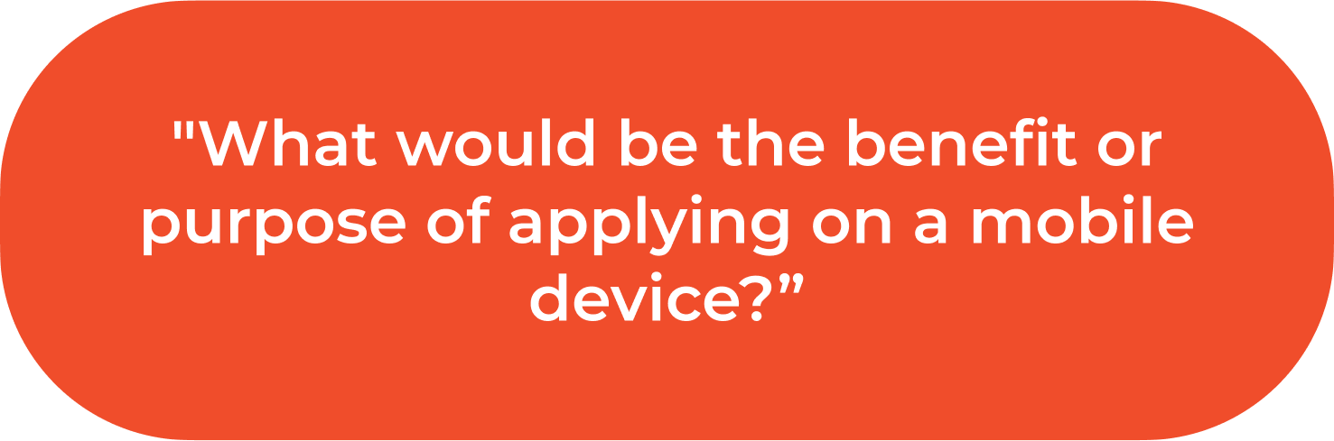
Through our user interviews, we learned that our users would never submit a proposal via their mobile device. Since the proposals are such complex documents, users were much more comfortable submitting applications on a desktop website.
Key takeaway quotes


Defining the persona, problem, & solution
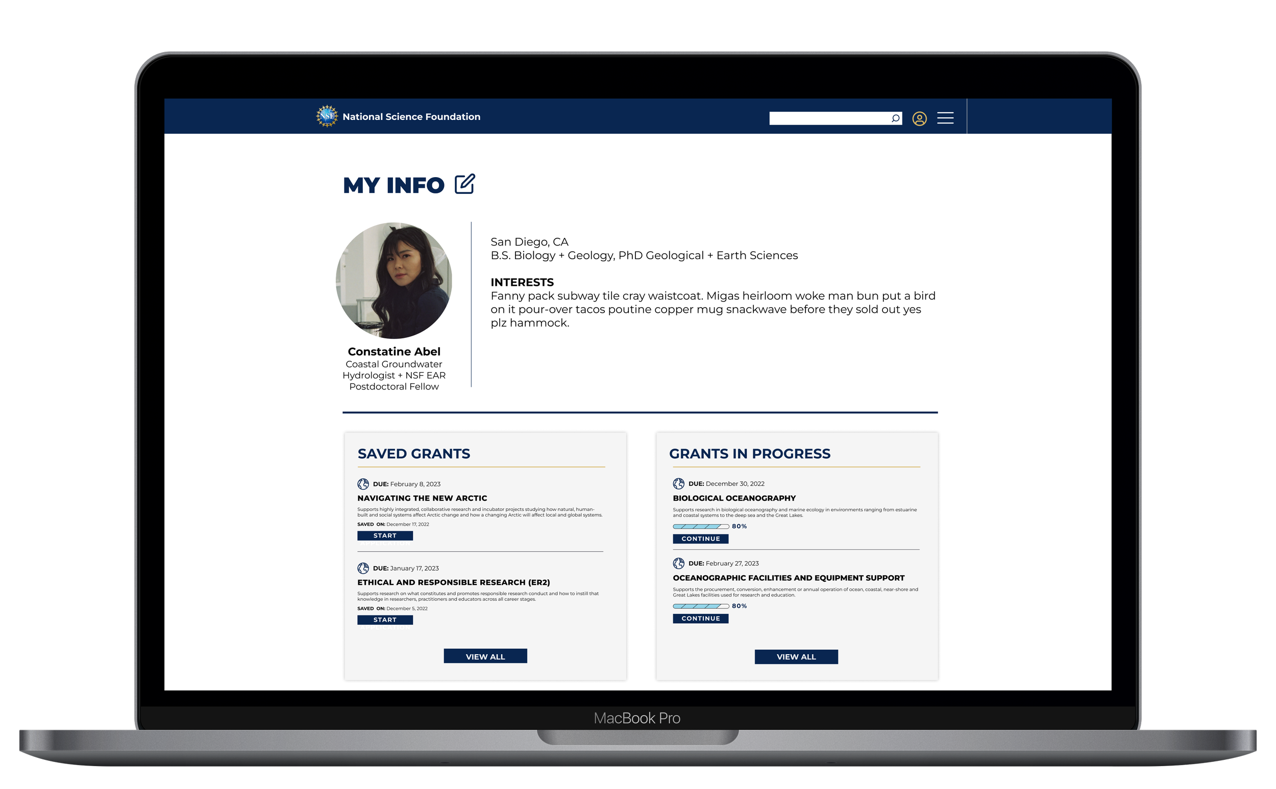
After completing our research, we were able to define a problem statement, a solution to work towards, and a persona to use as a representation of our core users.

We created our persona, Constantine, to represent our users. We kept Constantine and our empathy for her front and center as we worked towards designing a solution.
Problem
Users need a clear and efficient search process for grant applications. NSF’s website doesn’t provide this. The site doesn’t give users a way to stay organized through grant deadlines, eligibility requirements, and submission of documents without being redirected to multiple websites.
Solution
Design a clean, aesthetically pleasing mobile and desktop website with clear navigation to search grants and provide a seamless document upload flow that all can be done through a user profile, with saved information and documentation, that provides upload feedback.
Card sorting
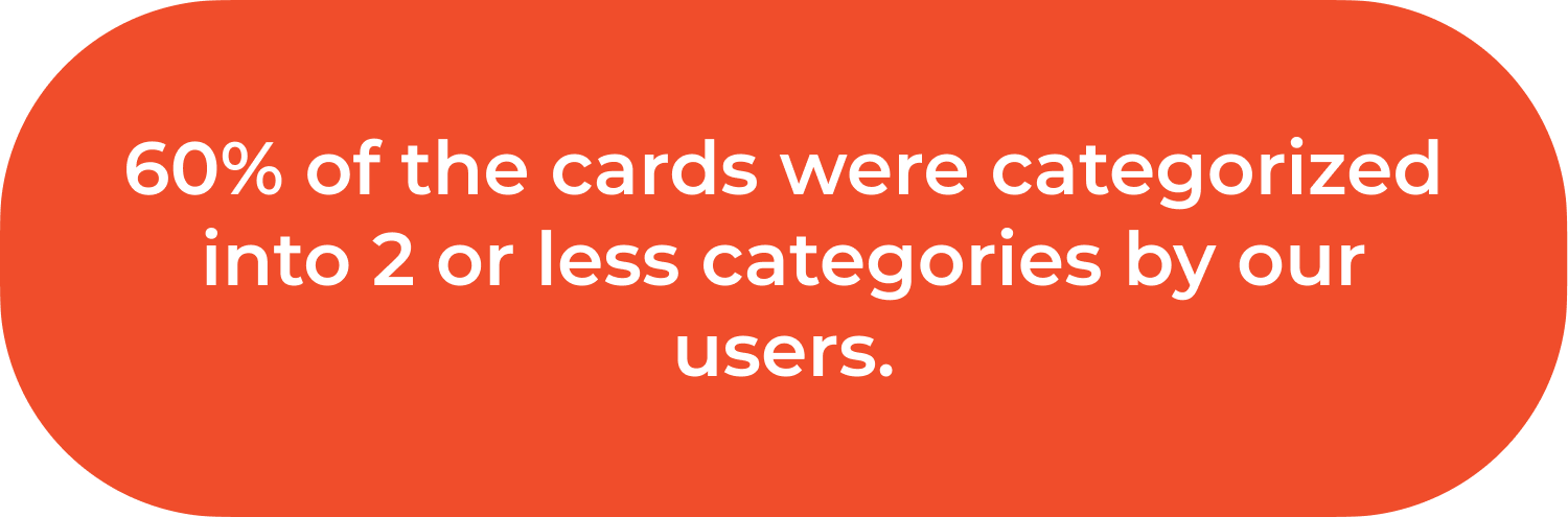
We conducted a hybrid card sort, where users could categorize items into specific categories or create their own categories if they felt item cards didn’t fit into any of the categories we provided.
We provided 5 categories to sort the cards into; Funding Type, Finding Grant Funding, Profile, Education Level, and Research Areas. Each category had the predicted items sorted at the highest rates.
There were 3 additional categories created by one user; Applicants, Grant Guidelines and Process. These results helped guide how we designed how users filtered and searched for grants and what features would be available in the user profile.


User task flow
In the current user flow to apply for a grant, the user starts the process by searching for an appropriate grant on NSF.gov, but when they are ready to apply for grant, they cannot actually submit their application on NSF.gov.
They must navigate to research.gov to apply, and also must remember or copy & paste important information like the grant ID, and the search inquiry they used to find the grant and restart the process.
Design phase
After a design studio session where we sketched, critiqued, and reiterated upon our foundational new designs, we created our low fidelity designs. The goal of these designs were to solve for our problems at a foundational level and be able to pressure tests these ideas through usability testing.
Low fidelity mobile designs


Figma prototype - low fidelity mobile designs
We gave our users the task to search for a grant in Geosciences based on the arctic, and save it to their profile. We then wanted them to navigate to that saved grant within their profile. We put some parameters around this, to complete the task in less than 4 minutes with less than 2 errors.
Usability Testing
Overall, our usability tests results were quite positive. However we did uncover aspects that had room for improvement. Some of the consistent issues among users were that they tried to login to their profile before starting the search for the grant, as well as tried to navigate backwards through the app, calling out the lack of ability to do so.
Usability Testing Results
Changes made to the prototype


Mood board & style guide
Through the use of a mood board and style guide to make small but valuable changes.
Simplifying the color palette we reduced cognitive overload and increased consistency.
Designing new Iconography allowed for improved information architecture and navigation, as well as delight.

A sophisticated text our users are familiar with, that has many weights to create visual hierarchy
A simplified the color palate to reduce cognitive overload and improve visual aesthetics
Iconography simplify information architecture and navigations
Our high fidelity design prototype is the culmination of our UX design process. We combined our revised UI, information architecture, and visual elements to create a design that fits the needs and behaviors of our users.
Through user feedback and iterative design, we were able to refine our design to create a user interface that is intuitive and easy to use.
High fidelity designs


Conclusion
The NSF.gov website redesign was a conceptual attempt to better understand user’s needs and to build an improved experience to suit these needs.
We were able to accomplish this by:
Building the user’s research and application flows on one single website, reducing confusion and frustration through clear information architecture and improved user interface, and improving navigation.
Creating a user login and profile, allowing users to save:
Grants of interest
Their proposal documents
In progress applications
Fields of interest
Previously applied for and awarded grants
My key learnings
To always stay vigilantly remain focused on the user, their behaviors, and their needs.
To reiterate as much as time allows: Improvements can, and will, always be made.
Government websites do not need to live up to their negative stereotypes—They to can be designed into a pleasurable experience for their users.