

What if...
A marketplace could sell anything — not just the things it was built for.
Epicurate was built to sell culinary experiences — custom tasting menus, private chef dinners, intimate chef's table events. The platform was designed around one product archetype — and it worked. Until partners started asking for things that didn't fit: ski rentals, baby gear delivery, golf cart bookings, fridge stocking. Each one a different shape. Each one breaking the model. This project was about redesigning the commerce layer so the platform could sell all of it — without rebuilding every time something new came through the door.
TL;DR
My Role
Solo Product Designer — research, IA, UI, systems
Timeframe
Dec - Jan 2026
Company
Epicurate — luxury hospitality marketplace
Phase
Shipped & ongoing
Tools
Figma · FigJam · Notion · Claude
Outcomes
Introduced unit-based products as a first-class commerce category · Defined a three-type product taxonomy that aligned design, engineering, and product · Signed Ski Butler as a partner — with bookings made immediately upon launch · Delivered within existing platform constraints — minimizing engineering lift while unlocking an entirely new commerce model
Problem
The platform was a single-lane road trying to handle all the traffic.
Every product on Epicurate was configured the same way: number of guests, date of service, done. That worked cleanly for a private chef dinner or a chef's table experience. It broke the moment a partner asked to list ski rentals, prepared food delivery, massage therapy packages, or fridge stocking — because none of those are sold by headcount alone. A ski rental is sold by the day, per unit, with size and skill level attached. A grocery order is sold by item. A massage add-on is sold per person, but with options a headcount field can't capture. The data model had no concept of any of it.
The problem compounded fast. Fridge stocking needed delivery windows and no collection date. Baby gear rentals needed drop-off and pick-up logistics. Golf carts needed start dates and rental durations. Each new partner type exposed a different gap — and there was no framework that could hold all of them. The team had been patching these with manual overrides and workarounds. That wasn't scaling.
What we needed wasn't a patch. We needed a new product primitive — one that could serve rental companies, delivery providers, fridge stocking services, massage therapists with add-ons, photographers with packages, and culinary experience providers who needed guests to specify exactly what they wanted before anyone could prep a single ingredient.
The Insight
"The platform wasn't failing because of bad design. It was failing because it was built around one product archetype and then asked to be a general marketplace."
Approach
Understand the product universe first. Design second.
Before a single component was designed, I spent time with the actual products in the wild. I went through live experiences on Noshable, Nashville Delivers, Justbeachy, and Ski Butler — testing them as a user, Cataloging what broke, and mapping the full decision surface a guest had to navigate. The goal wasn't to benchmark. It was to understand the full taxonomy of what Epicurate would need to support.
That research surfaced three distinct product types hiding under the "unit-based" umbrella — and this distinction ended up being the most important design decision of the entire project:
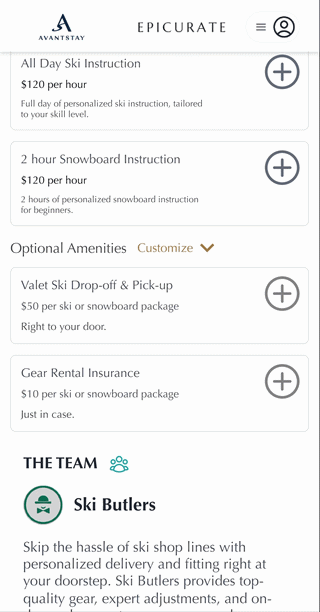
Type A — Booking-level products. Applied to the entire cart, not a single item. Think gear rental insurance, or a delivery surcharge. The user selects it once and it applies globally. No options, no per-item quantity selector.
Type B — Simple unit products. Bought in quantity with no configuration required. Three cases of beer. Five fresh fruit bowls. The user just picks a number. The interface should get out of the way.
Type C — Configured unit products. The hard one. A ski rental package where the user selects boot size, ski type, skill level, and number of days — all before it goes in the cart. Each instance is a unique configuration. The user might want to add two of these — but those two are different from each other.
The date-selection problem also needed its own answer. Because pricing and stock availability were date-dependent, users couldn't see accurate product information until they'd committed to dates. The design response was progressive disclosure — products visible but dimmed before dates are selected, with a persistent CTA anchoring the experience until dates were locked in.
Phase 01
Define
Complete- Product taxonomy (A, B, C types)
- Date-first flow architecture
- Competitive experience audit
- Stakeholder alignment on scope
Phase 02
Design & Ship
Shipped- Mobile-first product cards (all 3 types)
- PDP slide-in modal system
- Unit-based cart & checkout
- Desktop parity designs
Phase 03
Iterate
In progress- Refining designs based on live booking patterns
- Post-ship user feedback integration
- Expanding unit-based support to additional partner categories
Design
One interface. Three product types. All mobile-first.
The design started where the user started: mobile. The platform's traffic was majority mobile, and the booking experience was complex enough that getting it right on the smallest screen first would force the right decisions. Desktop came after — and largely inherited from the mobile patterns rather than reinventing them.
The core challenge was the product card. All three product types needed to live on the same shelf — the same page, the same visual rhythm — without any of them feeling like an exception or a workaround. A deliberate constraint shaped the outcome here: rather than redesigning the card component from scratch, I designed within the platform's existing card style. It kept engineering scope tight and stakeholder alignment easier, and it meant the new product types could launch without requiring a full UI overhaul alongside them.
Type A — Booking-level. Tap once, applied globally. Icon resolves to a checkmark.

Type B — Simple unit. Icon becomes an inline incrementor. No configuration needed.

Type C — Configured unit. Tap opens the PDP slide-in for option selection before adding to cart.
Type A products — things like rental insurance or a flat delivery surcharge — needed the simplest interaction: one tap, done, applied to the whole booking. The icon turns to a checkmark and the user moves on. Type B was nearly as clean: a simple incrementor, no interruption, just a number going up or down.
Type C was where the complexity lived. The Ski Butler experience was the clearest example: a guest needed to select ski type, boot size, and skill level before an item could go in the cart at all. That meant tapping the add icon had to open a PDP slide-in on mobile — where the guest could make those selections before committing. The challenge was communicating that this was a multi-step interaction, not just a tap-and-done.
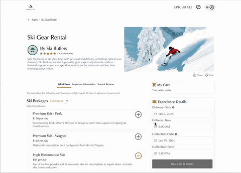
Desktop — PDP modal with option selection for a configured Ski Butler package.
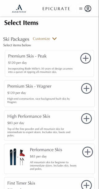
Mobile — PDP slide-in showing the same option selection flow.
A decision about dates
The simplest path was the right one.
Before any product could be accurately shown — pricing, stock levels, availability — the platform needed to know when the guest was arriving. We explored a few approaches: letting users browse freely and resolve conflicts at checkout, surfacing date selection inline per item, or requiring dates upfront before the browsing experience unlocked. The more complex paths created real UX debt: mismatched rental periods in the cart, stale stock indicators, and guests who'd built out a full selection only to find half of it unavailable for their dates.
The call was to require dates first — a persistent "Select Dates" CTA anchored to the bottom of the experience, with products visible but dimmed until a window was committed to. It's the same pattern Ski Butler, most rental companies, and booking platforms of this type already use. Familiar enough that it doesn't require explanation. Simple enough that it didn't add engineering complexity. And honest enough with the user that they're always seeing accurate information.
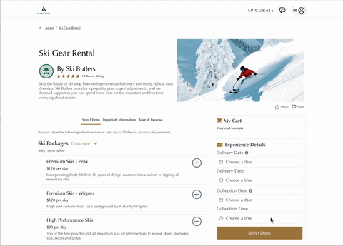
Desktop — date selection flow. Products are visible but inactive until dates are confirmed.

Mobile — same flow. The persistent CTA keeps date selection reachable at all times.
Result
A commerce system that could hold a ski rental and a hibachi dinner in the same cart.
The unit-based selling system shipped and immediately changed what the platform could offer. Ski Butler signed on and saw bookings made right away. Additional rental companies followed. Existing experience partners — private chefs, massage therapists, photographers — were able to add unit-based options that gave guests more control over what they were booking, while driving incremental revenue for providers. The platform could now legitimately represent rental gear, delivery services, prepared food, and add-on packages alongside its culinary core.
More quietly: this project introduced a level of design system rigor the product hadn't had before. Defining the three product types created a shared vocabulary for engineering and product conversations — and the component decisions made here became the reference for how new product types would be structured going forward.
New revenue category unlocked
Unit-based products — rentals, deliveries, configured gear — became first-class citizens on the platform for the first time.
Partners signed. Bookings made.
Ski Butler launched on the platform and saw immediate bookings. Additional rental and service providers followed — categories that had been structurally impossible to onboard before.
Constraint-forward execution
Every design decision was made within existing backend architecture. No new data primitives required — which kept engineering scope in check.
Design system foundation
The product type taxonomy and component library built here became the team's shared reference for all future commerce surface work.
Epicurate is an active engagement. Some artifacts are under NDA. Screens shown are from approved Figma designs and prototypes. Full prototype walkthrough available on request.