

What if...
An account was the beginning of a relationship, not the end of a transaction.
Epicurate's account infrastructure was tightly coupled to the booking flow. Users who hadn't booked had no reason to create an account — and no real home if they did. This project rebuilt the account from scratch as a relationship hub: a place to plan, save, manage, and return to.
TL;DR
My Role
Solo Product Designer — strategy, IA, UI
Timeframe
Two week sprint
Company
Epicurate — luxury hospitality marketplace
Phase Shipped
Crawl: Shipped | Walk: in progress
Tools
Figma · Notion · FigJam · Vercel V0 · Claude
Outcomes
Decoupled account creation from the booking funnel · Defined the Crawl → Walk → Run roadmap · Established the Trip as the platform's core data object · Became the design reference for the platform's IA and component library
PROBLEM
A platform treating its own users like guests.
This opportunity wasn't assigned — it was identified.
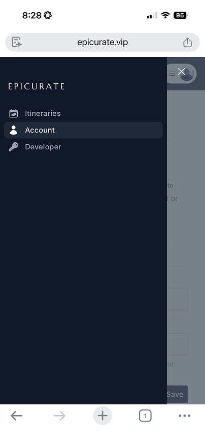
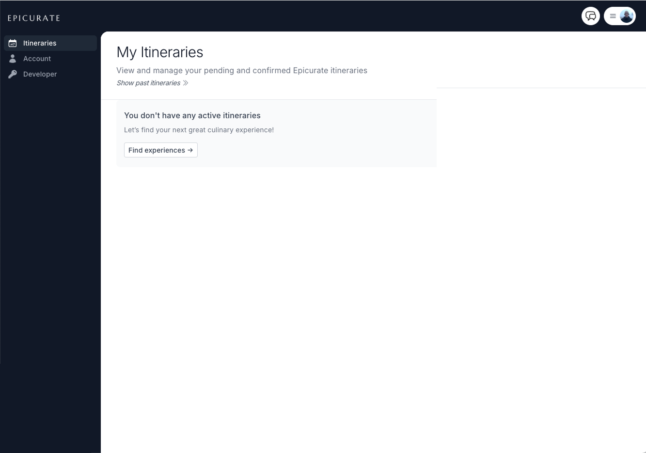
Epicurate's account experience wasn't really an account experience — it was a booking confirmation area with a login screen in front of it. Users who hadn't booked had no meaningful features. No onboarding, no saved content, no social layer, no reason to return.
This wasn't a cosmetic problem. The platform was missing an entire segment of high-intent users: planners, browsers, gift-givers, social sharers. And without an account worth having, there was no infrastructure for loyalty, personalization, or referrals.
The Insight
"What if the account reflected how users think about travel — not how the database organizes bookings?"
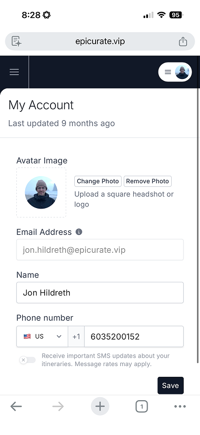
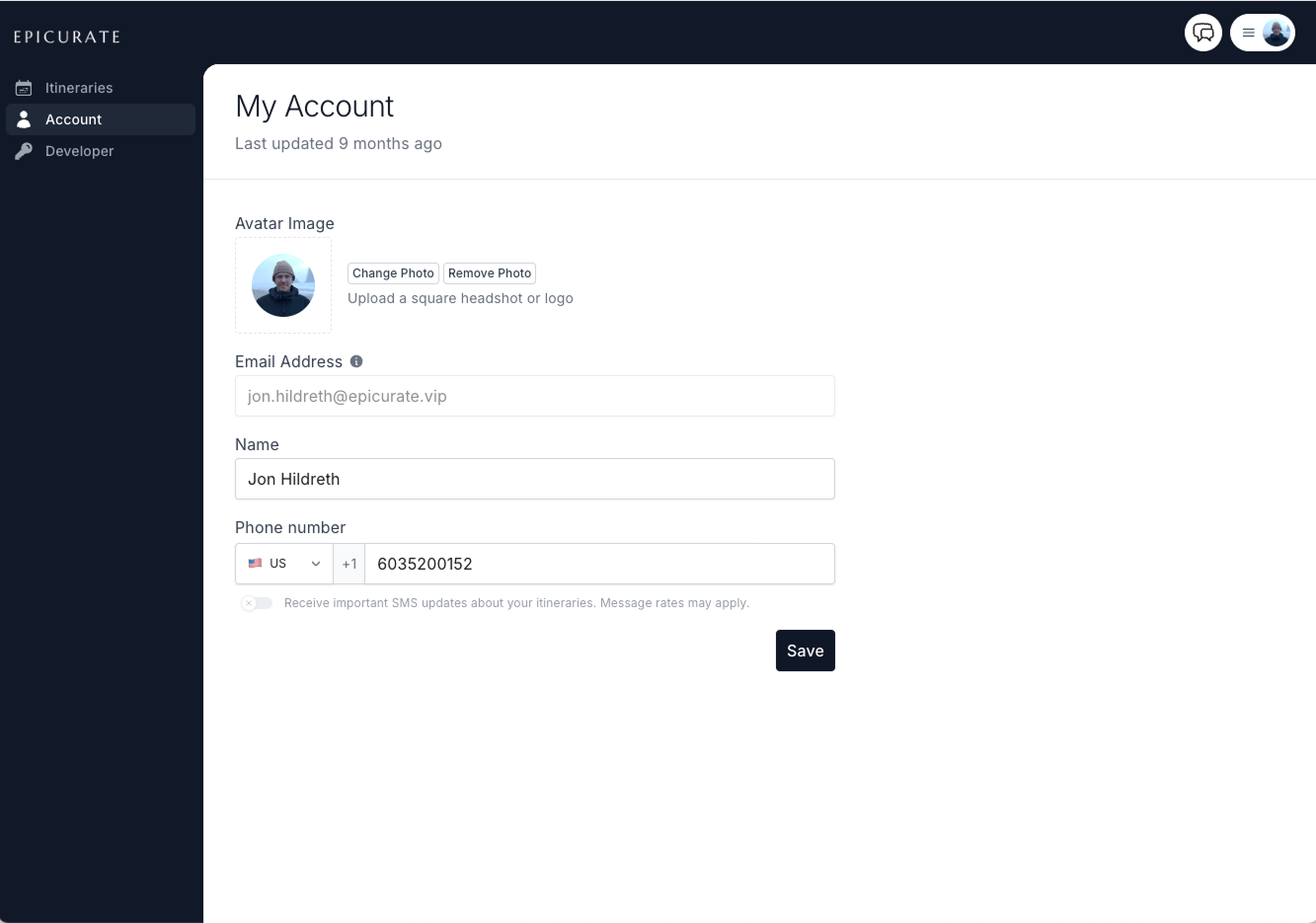
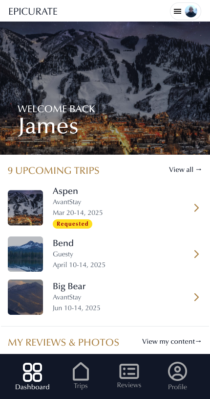
The account users had before this project
APPROACH
Build a relationship hub, not a settings page.
The first architectural decision: identify the core object that everything else orbits. That object was the Trip — not the booking, not the transaction, but the trip as a meaningful unit of a guest's life. This framing changed everything from navigation to data modeling.
From there, the work became defining a phased build path that could deliver real user value at each stage without building features that hadn't been earned yet.
Phase 01 · Shipped
Crawl
Every decision asks: does this serve the trip?
- Dashboard
- My Trips
- Reviews & Media
- Profile / Settings
Phase 02 · In Progress
Walk
Shifts account from transactional to relational.
- My Favorites
- Personalization
- Concierge Pipeline
Phase 03 · Planned
Run
Epicurate becomes a travel relationship platform.
- Loyalty & rewards
- In-app messaging
- Memory archive
CONSTRAINTS
What I wanted to design
What we shipped
DESKTOP-FIRST PLATFORM, MOBILE-FIRST USERS
Platform shift: desktop → mobile
The data tension
Desktop converts ~23% better than mobile and does it in less than a quarter of the time. With mobile driving 63% of traffic, this is the highest-leverage problem.
Design Process
Rather than presenting one direction for feedback, I used V0 to rapidly prototype three distinct approaches — giving stakeholders something tangible to react to and align on in a single session.
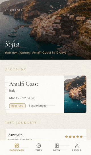
Bento Box
Asymmetric card grid — visual rhythm through varied card sizes. Content-dense but organized.
Editorial
Full-bleed photography, serif type, generous whitespace. More magazine than dashboard.
↗ Blended into final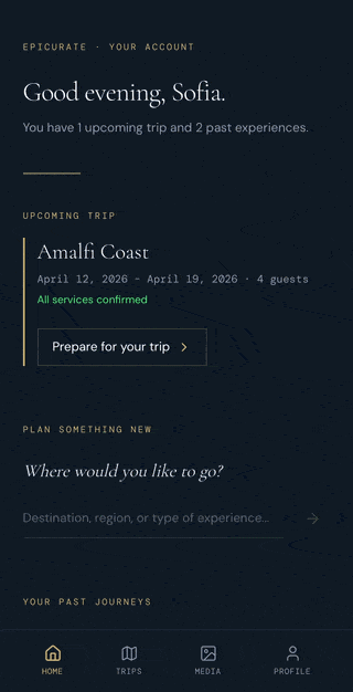
Calm
Minimal, high-contrast, stripped back. Prioritizes clarity over expression.
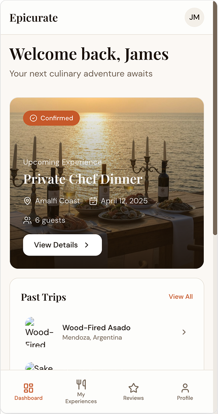
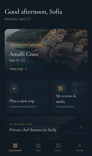
THE SHIPPED PRODUCT
The shipped product


RESULT
A foundation the whole product can build on.
The Crawl phase shipped a clean, focused account that established the Trip as the platform's core object — and set the architectural groundwork for loyalty, messaging, and personalization without building any of it prematurely.
More practically: the IA and component decisions made here became the reference point for the rest of the product team. What started as a user account became the design system's connective tissue.
Epicurate is an active engagement — some artifacts are under NDA. Screenshots shown are from approved V0 prototypes & Figma Designs. Full case study walkthrough available on request.