

What if...
An account was the beginning of a relationship, not the end of a transaction.
Epicurate's account infrastructure was tightly coupled to the booking flow. Users who hadn't booked had no reason to create an account — and no real home if they did. This project rebuilt the account from scratch as a relationship hub: a place to plan, save, manage, and return to.
TL;DR
My Role
Solo Product Designer — strategy, IA, UI
Timeframe
Two week sprint
Company
Epicurate — luxury hospitality marketplace
Phase Shipped
Crawl: Shipped | Walk: in progress
Tools
Figma · Notion · FigJam · Vercel V0 · Claude
Outcomes
Decoupled account creation from the booking funnel · Defined the Crawl → Walk → Run roadmap · Established the Trip as the platform's core data object · Became the design reference for the platform's IA and component library
Problem
A platform treating its own users like guests.
This opportunity wasn't assigned — it was identified.
Epicurate's account experience wasn't really an account experience — it was a booking confirmation area with a login screen in front of it. Users who hadn't booked had no meaningful features. No onboarding, no saved content, no social layer, no reason to return.
This wasn't a cosmetic problem. The platform was missing an entire segment of high-intent users: planners, browsers, gift-givers, social sharers. And without an account worth having, there was no infrastructure for loyalty, personalization, or referrals.
The Insight
"What if the account reflected how users think about travel — not how the database organizes bookings?"
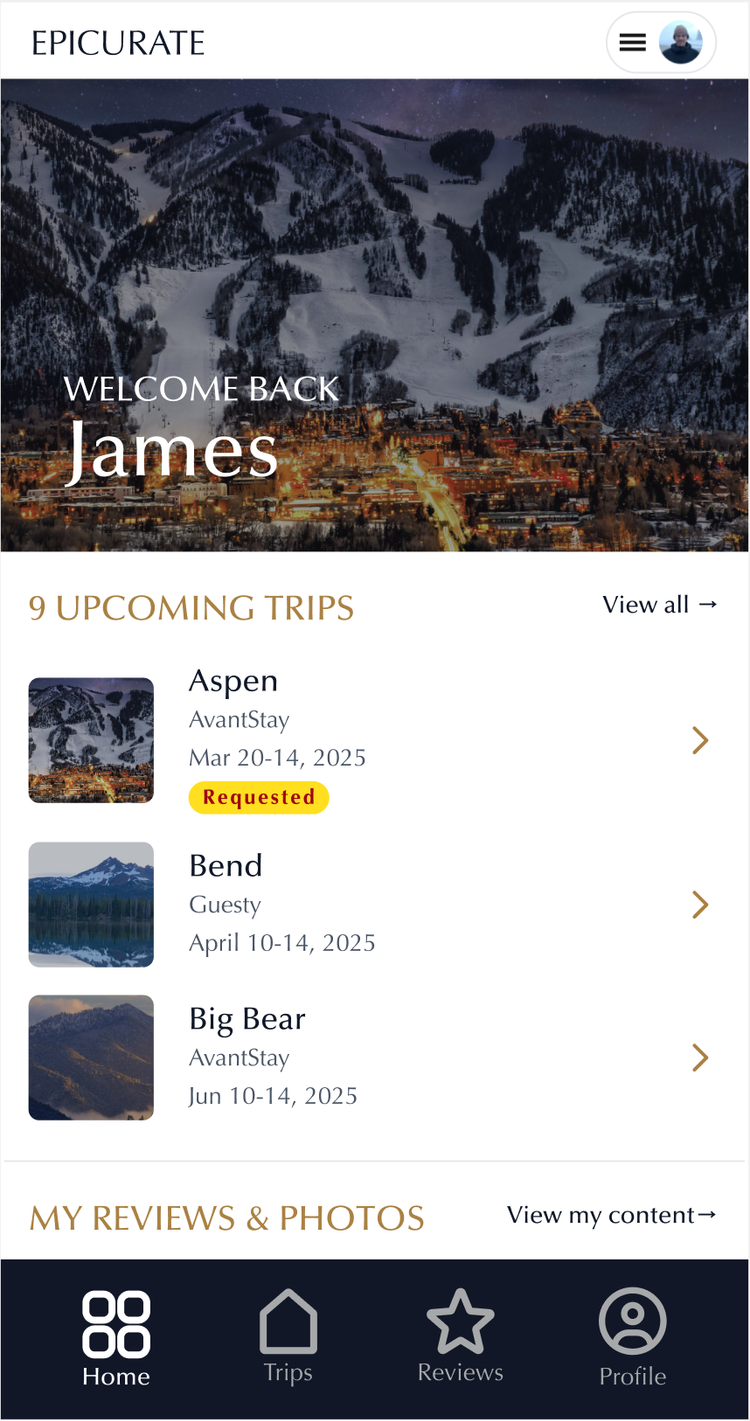
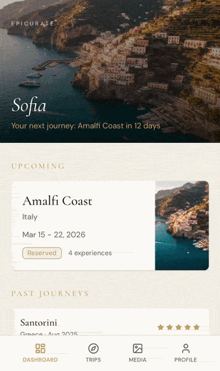
Before
The account users had before this project
Mobile
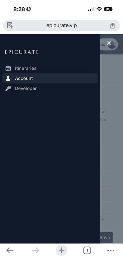
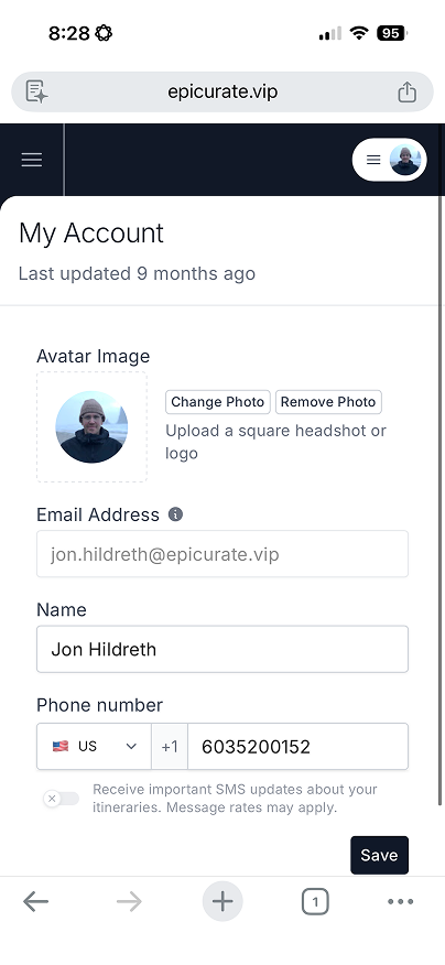
A settings page masquerading as an account. No trips, no dashboard, no reason to return.
Desktop
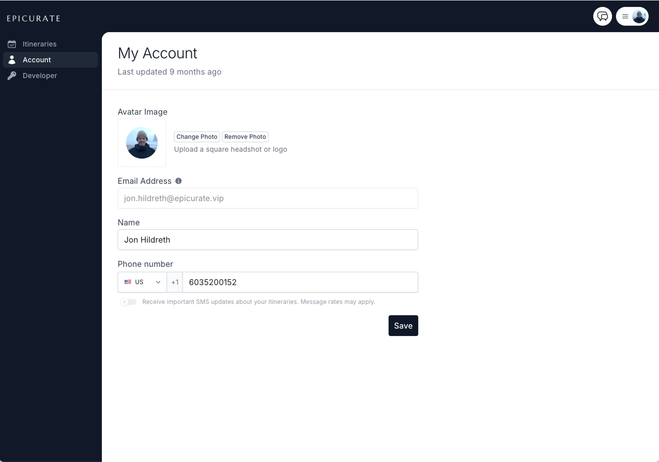
Tightly coupled to the booking flow. No meaningful features for users who hadn't transacted.
Approach
Build a relationship hub, not a settings page.
The first architectural decision: identify the core object that everything else orbits. That object was the Trip — not the booking, not the transaction, but the trip as a meaningful unit of a guest's life. This framing changed everything from navigation to data modeling.
From there, the work became defining a phased build path that could deliver real user value at each stage without building features that hadn't been earned yet.
Phase 01 · Shipped
Crawl
Every decision asks: does this serve the trip?
- Home
- My Trips
- Reviews & Media
- Profile / Settings
Phase 02 · In Progress
Walk
Shifts account from transactional to relational.
- My Favorites
- Personalization
- Concierge Pipeline
Phase 03 · Planned
Run
Epicurate becomes a travel relationship platform.
- Loyalty & rewards
- In-app messaging
- Memory archive
Constraints
Designing for incremental delivery
A small engineering team meant big design changes had to ship in stages. The constraint wasn't a failure of vision — it was the job.
What I wanted to design
V0 prototype — the editorial bento grid direction with cinematic hero and full redesigned navigation.
What we shipped
Shipped product — kept the existing left nav and top controls intact to match engineering capacity while advancing the core experience.
Holding the ideal design in one hand and the shippable design in the other is a skill in itself. The navigation stayed familiar. The account experience underneath it changed entirely.
Desktop-first platform, mobile-first users
Platform shift: desktop → mobile
More users were arriving on mobile than any other surface — but the platform was built for desktop first. The data revealed a clear tension: mobile was driving traffic, desktop was closing it. The design response wasn't to abandon desktop. It was to close the gap by making mobile worthy of the same trust.
The data tension
Desktop converts ~23% better than mobile and does it in less than a quarter of the time. With mobile driving 63% of traffic, this is the highest-leverage problem.
Design Process
Three directions. One session.
Rather than presenting one direction for feedback, I used V0 to rapidly prototype three distinct approaches — giving stakeholders something tangible to react to and align on in a single session. Each direction had a clear point of view. The goal wasn't to pick a winner outright, but to use the differences to surface what actually mattered.
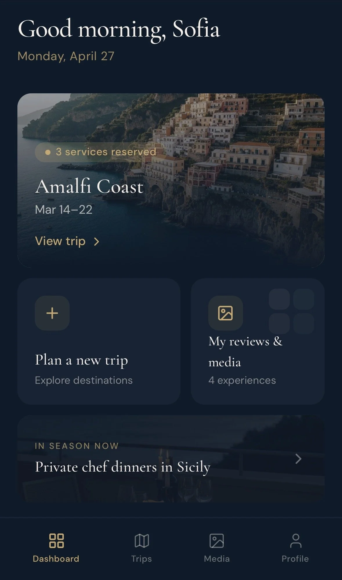
Bento Box
Asymmetric card grid — visual rhythm through varied card sizes. Content-dense but organized.
Editorial
Full-bleed photography, serif type, generous whitespace. More magazine than dashboard.
↗ Blended into final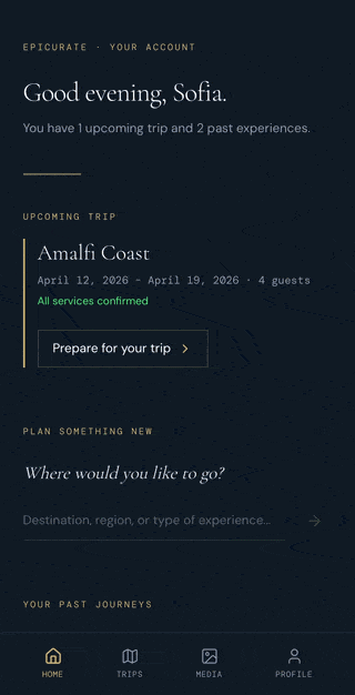
Calm
Minimal, high-contrast, stripped back. Prioritizes clarity over expression.
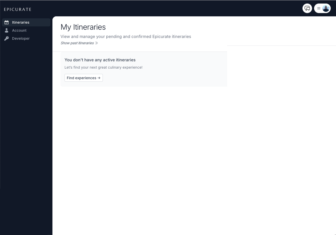
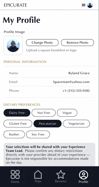
The Shipped Product
All four tabs. Live in production.
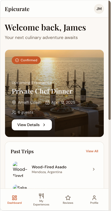
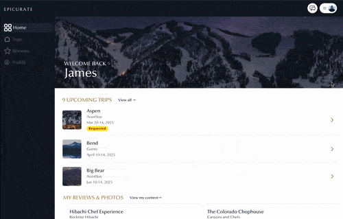
The Crawl phase shipped all four core account sections as a cohesive mobile-first experience with full desktop parity. Each tab was designed to stand alone while reinforcing the Trip as the connecting thread across the whole account.
Home replaces what was originally called Dashboard — a deliberate word choice to signal that this is a place users belong to, not a utility screen they manage. Custom icons were designed for the Home and Trips tabs, and a star icon replaces the previous document icon for Reviews — a small detail that makes the nav instantly legible.
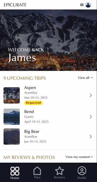
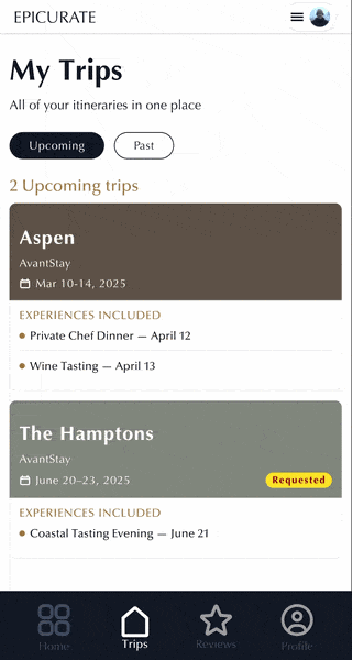
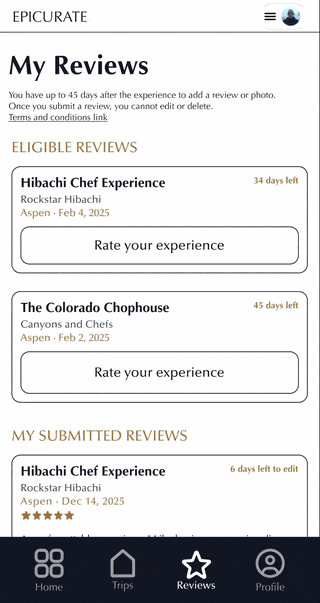
Home
Trips
Reviews
Profile
Desktop — full experience
Result
A foundation the whole product can build on.
The Crawl phase shipped a clean, focused account that established the Trip as the platform's core object — and set the architectural groundwork for loyalty, messaging, and personalization without building any of it prematurely.
More practically: the IA and component decisions made here became the reference point for the rest of the product team. What started as a user account became the design system's connective tissue.
Decoupled from the booking funnel
Account creation no longer required a transaction — opening the platform to planners, browsers, and gift-givers for the first time.
Trip as core data object
Established the architectural foundation that Walk and Run phases — loyalty, messaging, personalization — are built on top of.
Stakeholder alignment in one session
V0 prototypes replaced multiple wireframe revision rounds. Three directions presented, one direction chosen, no second meeting needed.
Design system reference point
The IA and component decisions became the pattern library baseline for the full product team going forward.
Epicurate is an active engagement — some artifacts are under NDA. Screenshots shown are from approved V0 prototypes and Figma designs. Full case study walkthrough available on request.